Friday, September 24, 2010

Orchard Keeper


i created this image in Photoshop for a book cover, The Orchard Keeper, by Cormac McCarthy.  please read the book, it might change your life.

The Loft


this is a poster for The Loft.  while in college i dreamed of something like this.  i have grown up a bit since then but this is one of the first posters i made. i was very proud of it - and still am.

College Ad


this is another one the my first posters.  it was controversial.  most hated the pink. others thought it was smart. my thought: i was targeting a 16 year old girl - enough said.  i love this ad.

Home


this photo is from a vacation i took to Oregon.  it was a beautiful day and a beautiful hike.  i charged up the color and added a few graphics.

for SBP


while working for Sandra Beyers Photography i created these cards. 
--One summer morning I woke up to the rain, pouring, on the tin roof of the garage outside my window. It was around 430, the sun was just barely coming up, and the iPod was still playing Dave Matthews from the night before.  I reach over and grab the Mac. 
The colors on these cards come directly from that early morning sunlight combined with the heavy rainclouds, the rain, and the green grass.  As the sun came up more, the green became lighter and softer. 
I will always remember that morning and I am glad I recorded my thoughts with something that people will hang on their fridges and look at everyday.

Carousels


one of my most favortite graphic design project.  summarizing the song lyrics through design.  it is fun yet meaningful.

Smile


my two best friends in college.  we always had so much fun so i wanted to create through graphic design.  what an easy picture to work with!

Snow. Boarding.


ahh my first time snowboarding. i feel in love.
--an edgey border for an edgey sport. i find it very fitting.  i like the contrast to be very harsh. i like that for all black and whites. the subject is the motivation for the outcome of this photo.

B A


me n cortney on the mountain. a pop of color combined with some harsh contrast.

The Semi


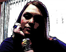
disc golfing....my favorite activity.  we went out golfing some time in december. with snow on the ground we had gloves and hats, and bottles of vodka, to keep us warm. 
--i added some warmer tons and faded it out to directly relate to the feeling i had that day.  this is one of my favorite designs.
--it is title "the Semi" because that is the name of the disc.  i think the vodka and the chill clouded my brain and that is why the Eagle disc now has the name "the Semi".